What are SSRS 2016 KPI Reports?

KPIs have been around in SSRS in some fashion for most releases. Row level indicators and gauges were added in 2008 R2, but even before that, you could roll-your-own KPIs with images and a small amount of custom code.

KPI stands for key performance indicator. They allow a business user or executive to see important metrics with just a glance. They convey the information with numbers, colors, and shapes.

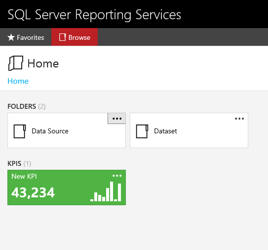
Starting with 2016, you now have another KPI option. KPIs can be added directly to the web portal. They are also supported on mobile devices with the PowerBI app. The report user will see the KPIs information directly on the web portal page without needing to run it. The figure below shows a KPI that includes a trend line. A trend line could represent the values for each month that make up the number shown for example.

kpi1

Another interesting difference is how they are developed. They are developed directly within the web portal. You don’t use a separate tool like Report Builder or Mobile Report Publisher.

To create a new KPI, you must have permission to publish reports within a folder. When you have that permission, you will see the New menu. Click New -> KPI to launch the designer.

kpi2

When the KPI is created, it is loaded with simulated data. That will give you a chance to see how the KPI will look and to understand which datatypes you will need in your dataset.

kpi3

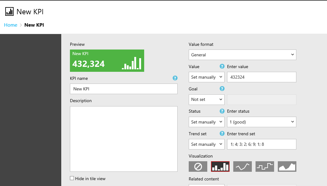
There are four data items to configure: Value, Goal, Status, and Trend set.

kpi4


You can connect each data item to a shared dataset. This can be the same dataset for all, or it can be different datasets for each. To connect to the dataset, change the data item to Dataset Field or Dataset Trend in the case of the Trend set.

kpi5

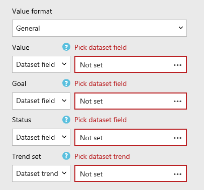
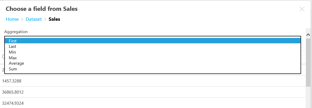
Click the ellipsis next to one of the data fields to navigate to one of the shared datasets. Note that only shared datasets will work with KPIs. Select the column to use and choose one of several aggregation functions.

kpi6

The Value and Goal data items must connect to a number. The Status must connect to a column in a dataset that returns 1, 0, or -1. The color of the KPI background is determined by the status, 1 for green, 0 for yellow, and -1 for red. The Trend is not aggregated.
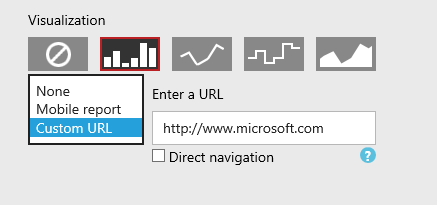
Fill in a name and optional description. If you are using a Trend set, select the Visualization.

The Related content property allows you to click through to a Mobile Report or a custom URL. If you have Service Pack 1 applied, you can also select the Direct navigation property for custom URLs.

kpi7

The new KPI feature is easy to configure, and should be useful for many companies. Now that you know how to configure KPI reports, the next post will tell you what you need to know to keep the data up to date.

Posted in SQL Server 2016, SSRS | 2 Comments

Always Learning…

This is my third January as an independent database consultant, and it is always a really slow month for me. This year, I planned ahead and decided to take advantage of the extra time on my hands. I decided to learn more about Azure.

I knew that there were several courses on EdX  and MicrosoftLearning  (related to EdX) on Azure so I started there. One of the initial courses is an introduction to PowerShell. I have written a few PowerShell scripts in my time, but I haven’t done it frequently enough to really become confident in the language. PowerShell was becoming popular and more useful with SQL Server about the same time that I left my job as a DBA. Since then, on the rare occasion that I have written as script,  I have used the age old technique of searching online for something similar to what I want to do and then modifying it. Until now, I never have taken the time to really learn it.  In addition to the EdX course, I found out that there is another PowerShell fundamentals course in TechNet Virtual Labs. There are also a number of courses on  Pluralsight.

I am continuing the Azure series on Microsoft Learning and will take a look at some of the Azure certification exams soon. I love learning and am glad that I have some time to devote to it.


Posted in Uncategorized | Leave a comment

What are SSRS Mobile Reports?

SQL Server Reporting Services (SSRS) has been around since 2004. I learned about it at PASS 2003, and probably had the beta version running as soon as I returned back to work from Seattle. Over the years, I have created many reports at my previous job at the law firm and for some customers since then.

I have been concerned that Microsoft was going to abandon SSRS eventually. For a while, new features were supported in SharePoint only, and new products such as Power BI have been released. I was happy to learn that Microsoft rebooted SSRS with SQL Server 2016. There is a new web portal, support for modern browsers, and a fantastic new feature called Mobile Reports.

Mobile Reports are dashboards that will run on most modern mobile devices as well as within the web portal. They are supported on IOS 9 and later, Android 4.4 or better, and Windows 10. To run Mobile Reports on these devices, the mobile Power BI application must be installed.

At first glance, they are simple to create. There is a new tool to use, the SQL Server Mobile Report Publisher. The tool will look familiar to you if you have worked with Datazen in the past. Microsoft purchased Datazen in 2015.

 mobilereportpublisher
You add controls to the design surface, and there is a design surface for three sizes: master, tablet, and phone.
phone-view
As you drag the controls over, they are populated with simulated data. You replace the simulated data with imported Excel spreadsheets or connections to shared datasets.
simulated-data
There are five major types of controls that can be added: Navigators used to filter the dashboard, gauges, charts, maps, and data grids.
five-types-of-controls

In my opinion, creating dashboards is simpler with Mobile Reports than with traditional paginated SSRS reports. I have never been comfortable with the gauge control in SSRS. It’s simple to set up in a Mobile Report.

There are several chart types, and each one is configured a bit differently. I spent quite a bit of time figuring them out for my Pluralsight course. The tree map, one of the chart types, is the most complex control.

tree-map
Overall, I am excited about this addition to SSRS. In the future, I will recommend creating Mobile Report dashboards over dashboards in paginated reports for my customers. Look forward to more posts about SSRS Mobile Reports from me over the next few weeks. Next time, I’ll blog about KPI reports.
Posted in SQL Server 2016, SSRS | Leave a comment