
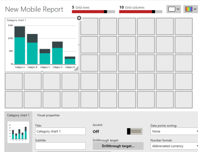
There are several chart types found in traditional paginated SSRS reports. The charts have many properties, but these are configured the same from chart type to chart type. SSRS Mobile report charts are very different. Each chart has a specific purpose and unique properties.
The Category Chart displays a value over a series. For example, you may want to display total sales by territory. The category, or series, is required to be one of the character data types (char, nvarchar, etc.).
To demonstrate, I created a new shared dataset called SalesCountByYear. Here is the query using the AdventureWorks2014 database:
SELECT COUNT(*) AS SalesCount, YEAR(OrderDate) AS OrderYear
FROM Sales.SalesOrderHeader
GROUP BY YEAR(OrderYear);
After launching Mobile Report Publisher, I added a Category Chart.
After switching to the Data page, this is how the simulated data looks:

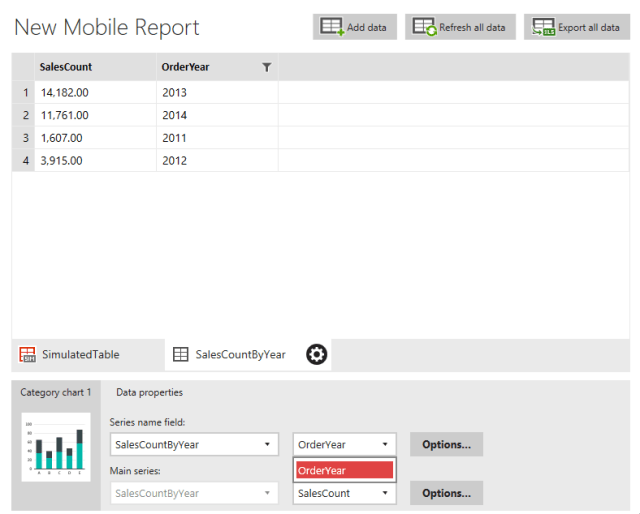
Notice that the series field can be only Category or FilterKey. These both contain character data. Next, I added the SalesCountByYear dataset to the Mobile Report.
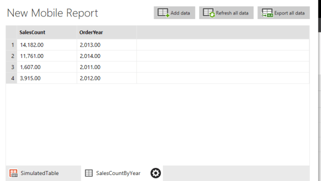
Notice that OrderYear displays decimal points. I switched the dataset in the Series field name property, and found that neither of the columns in the dataset can be used.

Numeric columns cannot be set as a Series name field. To work around this, I modified the dataset, casting OrderYear as a CHAR(4).

You can refresh the dataset in the Mobile Report, but I found better results by deleting it and adding it back. Once that was done, the OrderYear values looked better without the decimal places, and OrderYear was available to use as the Series name field.
This is how the chart looked after making the data type conversion:

The Comparison Category chart works similarly to the Comparison Chart. The Comparison Category Chart allows you to compare two values over the series. You will see the same data type requirements for the Series name field property.
Would you like to learn more about SSRS 2016 Mobile Reports? Check out my Pluralsight course!


Pingback: SSRS Mobile Reports | WIT Society